The five worst jumpers in AFL/VFL history

This is a little later than I promised, I know. It’s been difficult to narrow it down to the five worst jumpers, so the honorable mention category is going to be a little bloated. This article has been born from my look at every club’s jumpers in the competition, which you can read part one of here and part two here. There have been some really terrible jumpers in the game, but unsurprisingly, most of these jumpers have been promotional jumpers, or used in the pre-season. There are more promotional jumpers than ever in the AFL, but not one of the jumpers mentioned in this article will be worn this season, or has been worn in this decade. Basically all of the jumpers were worn in the late-90s, when teams were catiously stepping into marketing and promotional outfits. When clubs were less secure than they are now, meaning North Melbourne and St Kilda could essentially have their jumpers bought for a game or two. When teams tried to stand out from the others as the competition wasn’t the complete marketing and economical power it is now, so teams tried their hardest to connect with fans. I can’t imagine any of this worked that well, but these clubs had to try something.
As before, these jumpers mostly came from footyjumpers.com, the endless resource for everything that was worn in the past 150 odd years.

Honorable Mentions

The oldest jumper mentioned in this piece, by about 60 years, is the 1935 Footscray home jumper. The Footscray jumper is a great, historical outfit. Why they decided to change things up in 1935 and wear a clown style outfit is a mystery. Luckily, those jumpers were destroyed in a dry-cleaning incident. Hopefully it was deliberate sabotage.
Hawthorn undoubtedly have had the worst time trying to wear suitable pre-season jumpers. Their 1997-99 jumper was horrid, but at least it was a football guernsey. Hawthorn’s 2000 pre-season jumper, with sleeves, was a rugby outfit, and an ugly one at that. The lighting look would have made for a bad high school field hockey outfit in the mid-1990s, but for a professional AFL team, it was terrible. At half-time of one of their games, the Hawthorn players complained it was too hot in the sleeves so they ran back out after the long break with the same jumper, but without sleeves. A pure debacle.
Perhaps Collingwood’s growing skepticism towards wearing clash jumpers grew from their awful run with pre-season jumpers in the 1990s, the worst of which is definitely the 1996-97 Magpie jumper. The cartoon Magpie on the front wouldn’t have resulted in a great jumper had it been put on a traditional guernsey, but with the awful barcode design it resulted in a really bad look.
The first upset, with the Pura Light Start St Kilda yellow not cracking the top five. It isn’t a good jumper, don’t get me wrong, but it isn’t as awful of a crime as those below. Yellow was a part of St Kilda’s look after World War I as their black-red-white colours represented Germany, so it isn’t a complete outrage they included yellow on their jumper, and it certainly stands out from opposition teams. It was intended as a clash jumper, but suspiciously the clash issues subsided within a few years. It’s still a comical jumper to look back on but there was a little purpose about it.

5. The Fitzroy Checkered Border

This was just an honest mistake. Fitzroy tried to change things up during the Fitzroy-Preseason-1995pre-seasons of 1995-96 by chucking out a terrible jumper. The Fitzroy crest of the home jumper was replaced with a lion, the basis for the Brisbane Lion jumper, the backing was changed to blue and the diagonal stripes down the side carry the pattern of an oversized lollypop.

4. The Hi-Vis Kangaroo

The Roos certainly weren’t going to be lost on the field on round 21, 2000. North-4Coming together with the phone company Orange, North avoided a clash with Collingwood by wearing an orange version of their away jumper, then disregarded the avoidance by wearing black shorts and black socks. On the back of a day out from Nick Davis, Collingwood kicked five goals to one in the final quarter to win by 18 points and the orange jumpers weren’t worn again, but they can never possibly be lost. Like an apprentice on his first day at the job site, those jumpers stuck out.

3. The 3D Docker Anchor

The crooked 3D anchor, the lifted number crest on the back, Fremantle-3the green-red-white stripe down the center, this was all wrong. Why the anchor was crooked, I’m not sure. It certainly distinguished itself from the original home jumper – which I am almost a fan of – but there was just nothing good to say about this jumper. Combined with the inevitable white shorts the away team had to wear, this was breaking all kinds of fashion laws.

2. The Psychedelic Vomit Eagle

I really don’t understand this. It’s like whoever was in charge of the outfits West-Coast-Away-2000for the club was messing around on power point, trying to get the perfect WordArt, flicked their mouse to the colour finder screen and became enamored with the colour fade shown on the screen. Where the cyan blue on the back came from, who knows, why the Eagle sort of camouflages itself into the jumper, who knows, how this lasted for three seasons, who knows. It’s a modern day mystery.

1. The Hawthorn Diamond Studded Jockey

It had to be. There is no more disgraceful jumper in history. Hawthorn-Preseason-diamondIt really doesn’t have any ties to Hawthorn at all, the blue back doesn’t make sense and the diamonds are awful. This jumper was like some kind of triumph in a quest to wear something that is as far removed from a teams jumper as possible. It is extremely humorous though.

The best and worst jumpers of every AFL/VFL club, part 2

Welcome back. After wasting 3,000 words of your time on part one, it’s good to have you back. We’ll quickly go over some rules here, trust me it will be briefer than part one. Which, if you haven’t read, you can do so right here. Each team will have a judgment over their best and worst home jumper and best and worst away jumper. Away jumpers include clash jumpers. Just because I’m kind, I’ll throw in a section about special jumpers, promotional, Indigenous and others. Every single jumper wont be mentioned, while I’m wasting a lot of time on this, I’m not willing to waste all my time. University doesn’t get a section in here, but South Melbourne is split from Sydney Swans. No State of Origin teams, or International Rules, but who knows, maybe in the future. Also, I know Footscray/Western Bulldogs should have come before Gold Coast alphabetically, but I didn’t think of that one week ago. As always, this is all just my opinion. If you have any issues, feel free to comment them at the bottom, or attack me on Twitter. Basically all of this info is drawn from footyjumpers.com. It’s a great site.

Footscray/Western Bulldogs

Best home: The Footscray jumper is a great, traditional, home spun look. There is nothing wrong Footscray-1935
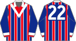
with the current jumper at all. The hoops were lowered slightly in 2015 so the number rests neatly on top of the hoop, and it is a great touch. The older jumpers were fine as well, there are a lot of years of quality jumpers here without change that look great. The hoops got put together a few times, and in 1975 Footscray changed the hoops into a red hoop with white outlines, and even that looked good. Give the best to the 1946 onwards jumper (officially the Bulldogs wore it 1946-50 and 1952-69), just because of the old style collars.
Worst home: Look, the Bulldog silhouette on the jumper wasn’t a great look. It was a downgrade from the other jumper, there is no doubt, but the Western Bulldogs need to do anything they can to create a brand and bring in money, so it makes a little sense, and it still was an ok-ish jumper. It’s not the worst though. Despite a strange decision to switch from royal blue to navy in 1944-45, the honour of the worst goes to the 1935 jumper. This is a horror. A clown outfit, with veritcal stripes and a bad white vee. Apparently, the jumpers were all destroyed after the 1935 season when they were dry-cleaned and thank goodness for that.
Edit: While the jumper still isn’t perfect, it looks great in this painting tweeted to me.

Best away: The Dogs have tried a few away jumpers, While the newer red backed reversal of the home jumper is alright, the white backed is the best one. It’s a good clash jumper, and a solid reversal, while not being as garish as the red back.
Worst away: The Dogs tried wearing a pre-season jumper during 1995-96 that was trying too hard, but the worst was an Origin Energy jumper from 2005 that took the company logo and made a jumper out of it. Not a good look.

Specials: The 2003 heritage jumper was a reworking of the 1935 version, taking out the vee to make it more bearable, but it still didn’t look great. Their Indigenous jumper wasn’t too bad, the little drawing of a footy field on the front was a little unnecessary though. The Dogs tried a couple of pre-season jumpers, a white backed one in 1979 and a blue backed in 1980 with coloured lines on the left side of the player. They would be pretty good jumpers for a TAC Cup team to wear, actually. The 1999-00 pre-season jumper was the same as the home, but removing the red hoop in favour of a red fill on the top third of the jumper and it wasn’t too bad, the follow up in 2002 took it a step further by creating a larger white outline over the bulldog logo, which was unnecessary. This year, the Dogs introduced a Ballarat jumper, with a star-flag type design (likely taken from the Eureka Flag) and a cartoon Bulldog. The flag design is a nice touch for Ballarat, but cartoon animals don’t really belong on jumpers.

Greater Western Sydney Giants

Best home jumper: We aren’t starting with anything special here. GWS have altered their collars three times and that is all. I’m more of a fan of the V style collar, so the inaugural jumper wins. GWS-ACT100-2013
Worst home jumper: The latest jumper has a difficult collar. It has a flap on the below half of the V, and from experience that flat can be a bit restrictive.

Best away jumper: In 2014 the Giants altered their away jumper to add a charcoal strip to the jumper, as a homage to the home jumper. It looks nice, and it isn’t plain like the original version.
Worst away jumper: The original jumper is quite dull. There is just G in the centre and that is really about it.

Special jumpers: The Giants have had a few variants in the specials category. In 2013, as a celebration of Kevin Sheedy‘s last game as head coach, the Giants had a little paragraph about him on their jumper. Outside that, their Canberra jumper features a cross on it, perhaps hailing Tony Abbott as the messiah. It’s not a bad touch. In 2013 they changed the cross to gold to celebrate 100 years of Canberra, which also was a adaptation look.

Hawthorn Hawks

Best home: Brown and gold is a difficult combination to pull off, and the vertical stripes are pretty gross. Hawthorn-Preseason-diamondUp until 1950, they didn’t exist. When Hawthorn entered the VFL in 1925, they had a brown base with a gold vee and a club crest over the heart. The vee on the back is unnecessary, but it is a really nice jumper, with the crest adding a great touch.
Worst home: The inverted original isn’t very nice, but those poos and wees stripes, they’re pretty ugly. Out of the VFL clubs, Hawthorn probably has the worst home jumper, but heck, it certainly doesn’t hold them back. Basically the biggest trouble with Hawthorn jumpers is how to put the numbers on the back. They flirted with brown squares, white numbers on stripes, white squares, all gold backs, and finally stripes up until halfway of the back. The worst has to be the brown square look from 1952.

Best away: In recent years, the Hawks introduced a reversal jumper, brown with gold on top and it isn’t as bad. There have been two variations, with a HFC letter logo and without, introduced this year. The without is better, just because the logo feels intrusive on the back.
Worst away: The 1997-98 away jumper was plain weird. It isn’t ghastly, but the cartoon gold hawk with a wing looks really strange. The white background clash jumpers are hard to pull off, and Hawthorn are still waiting to pull one off. The current clash jumper with a hawk swooping down isn’t great, but the 2008-11 look is worse.

Specials: Oh goodness me. There are some beauties in here. Let’s balance it out. The Indigenous jumper is quite nice, a good use of brown. The Kokoda jumper is not good, it was a really nice sentiment and I don’t want to quash the feeling, but it just looks bad. Hawthorn’s random 2005 heritage jumper, a blue look with red and white, a throwback to the original 1902 jumper is kinda great. The crazy lightning look is not good. The Hawks wore it – with sleeves! – until half time of it’s last game, when it was swapped for the sleeveless version because it was too hot. I wish I was making that up. It get’s worse, or better, I’m going with better. The official, worst jumper I have seen in the process of these two pieces. Say hello to the jockey outfit. It was worn once, in a pre-season game against Sydney and it’s so bad it’s beautiful. Whoever designed this bad boy deserves a knighthood for services against the Hawthorn Football Club.

Melbourne Demons

Best home: Melbourne have had a surprising amount of variations in their jumpers, at least until 1935. Melbourne-Clash-2008Originally, the Demons had a blue outfit with red lace. In 1919, a red vee was added that wasn’t filled in like it is now. The vee was pulled closer to the neck in 1925, and a band was added around the sternum in 1926. It was removed in 1930. The yoke has altered minimally over years, but that isn’t really important. 1998 brought a more standardized, modern look that is nice enough to take the crown.
Worst home: The 1926 band is a little silly, and there haven’t been many good jumpers from 1975, when teams tried to be more colourful for the television. So that can be the worst.

Best away: Hmm. There aren’t a lot of good ones in here. The 2009 Demon chest on red was passable. But the two 2015 jumpers are pretty good. They involve a lettered logo on the chest, with a contrasting background. The red with blue lettering looks a little too much like a training jumper, and the white with blue lettering is good enough to be the best.
Worst away: The 2004, sneaky demon in the corner outfit wasn’t great. It always kind of reminded me of a pack of Redheads. From 2011-14 Melbourne went with an inverted clash jumper and it didn’t come off, but the 2008 silver outfit is a real stinker.

Specials: Melbourne’s heritage jumpers aren’t interesting, and their Indigenous jumper is a bit of a disappointment. The crest on the centre should have been replaced by some Indigenous artwork of some sort. One pre-season jumper from 2001-02 involved a kind of droopy yoke, I’m not sure why. For some comedy, in 2011 the printing came out too pink and had to be used for one week of pre-season, then shelved. Luckily, Melbourne have pulled off field of women jumpers. The pink-red swap is genius and both the 2010 and 2014 outfits are excellent.

North Melbourne Kangaroos

Best home: Before 1933, North Melbourne wore an all royal blue jumper with a white vee,North-4 
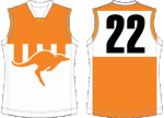
after 1976 North went to three blue stripes on a white background, and that is about it. In 2005 the three stripes were made thinner, which I think was a mistake. The thicker stripes look traditional, and the 1997 jumper had the best number font, so that’s the winner.
Worst home: Between 1959-72, the Kangaroos went with a thin striped look. It contained four stripes, with a collar and a number square. It is very busy, and the pin stripes on the front look silly. Thankfully, North moved on.

Best away: Why North would use any away jumper other than the original 1925 home jumper, I don’t know. It’s a solid opposite, it’s traditional and it looks good. They tried it in 2007-08 with a club logo in the middle and it worked well, more of the same please. The current reversed version of the home jumper is fine, but it doesn’t seem to be that much different to the home jumper if it is around for clash reasons.
Worst away: North have tried so hard to incorporate a leaping kangaroo on their away jumper but they haven’t really found a good one. They tried it in the late 90s and it didn’t really work, in 2003-04 they went for a blue and grey look, didn’t really work, and in 2005-06 they went for a kangaroo going across the side from front to back, didn’t really work. None of that is as bad as the ‘Argentina’ jumper. It’s a nice look for Argentina, for North it just looked soft.

Specials: North have tried to wear some kind of faded blue, wavy jumper in recent pre-seasons. It isn’t good, but the pre-season exists so clubs can try some new things. Their Indigenous jumper is quite good, the Kangaroos paw in the middle is a great touch to Australian history. Let’s be honest though, the bright orange, hi-vis promotional jumper from 2000 stunk. It wasn’t hard to spot Kangaroo players on the field that day, so there is a positive.

Port Adelaide Power

Best home: There is no doubt, the new jumpers are much better than the original look. The current jumper is onPort-5ae of the best in the competition, it is intimidating, it is simple and the design works perfectly. It was designed by a 7 year old as part of a competition, and when it was worn it was such a success that Port asked the AFL permission to make it their official home jumper. I hope that kid got some royalties.
Worst home: You know where this is going. The original home jumper wasn’t any good. It’s easy to feel sorry for the Power here though, they have a great jumper in the SANFL and weren’t allowed to bring it across to the AFL. The original jumper tried to pay homage to that traditional look, but didn’t quite get it.
Best away: Yeah, current jumper. It’s a good reversal of a great jumper.
Worst away: Not good. Port tried a busier version of their home jumper for their first away jumper, which wasn’t great. They wore a High School basketball program style jumper against Collingwood in 2002 once, they tried a simple lightning look that didn’t come off, so they then tried a difficult actual lightning look, which was really cool in 2004 when I was ten years old, but isn’t cool now. That jumper needs to be struck by lightning and destroyed, if that would work, I don’t know what happens when lightning strikes polyester.

Specials: The current pre-season jumper is a teal backed version of the current home jumper, and it kind of sucks. Their heritage jumpers are always a delight though. The ‘prison bar’ look that Port Adelaide wears in the SANFL is a great jumper, and every time they get to wear it in the AFL is a win for the club. Their other heritage jumpers have been good too. A magenta type jumper that they wore in 2004 was really nice to wear once, as was their Geelong-style light blue hoops that they sported in 2005. Once they get around that original jumper, Port Adelaide have some really great looks.

Richmond Tigers

Best home: There’s a surprising amount of early variance here. In 1914, Richmond Richmond-PS-2006adopted the sash and before that they went through a string of random patterns, all with the yellow and black colour palette. There’s more on that later, but from 1914, the sash has only been swapped, thickened and removed (later restored) from the back of the jumper. The nice wide numbers that appeared half way through 2005 are the easiest to read and the best jumper.
Worst home: Those early jumpers, while interesting, weren’t great. In 1910 the Tigers went for a thin stripe across the sternum and widened it in 1912. These kind of jumpers were kind of popular at the time, but they are pretty useless. There is no wonder none of the plain striped jumpers survived, only the Western Bulldogs have kept a similar look. The worst belongs to the Hawthorn style, vertical stripes from 1908, with the stripes looking kind of thick and ghastly, like Vegemite themed window shutters.

Best away: I’m not sure any of these jumpers deserve to be the best, but there must be a winner. I guess the more yellow of 2014 was a kind of suitable clash jumper? Maybe?
Worst away: I think the 2015, reversed clash jumper makes complete sense. It is definitely opposite to the home jumper. But I don’t think it looks good. Yellow is a colour you have to keep minimum, or give it the whole outfit. A black sash halfway through isn’t good on a yellow jumper.

Specials: Richmond wore a more Hawthorn-style thin vertical striped jumper in 2008 for the centenary of their club, and a red and yellow vertical striped jumper in 1978 for the Willis Cup, to avoid clashing with Glenelg. Richmond’s pre-season jumpers have been pretty useless. They’ve tried three different claw marked jumpers, between 1998-03 (with a year off in 1999, perhaps to redesign the jumper and come back with the same one), a yellow-backed version in 2007-08 and more of a tearing claw in 2009-10. Claw jumpers never work. Really, they don’t. They also tried two waved jumpers, in 2011 and 2012, they weren’t a disaster but they weren’t good. There was also the infamous Silver Top Taxis jumper RIchmond tried out. That was worth a laugh, and I’m sure the Tigers got a fair pay packet out of it too. However, Richmond have tried four different Indigenous jumpers, and they have all been pretty good. The secret may be that they incorporated the Aboriginal artwork into the existing jumper. It worked well in 2011, 2012, 2013 and 2014. However, the 2014 look might be the weakest.

South Melbourne Swans

Best home: South Melbourne cycled through several styles of red and white before they settled on their red vee. South-1921Between 1920-22, South tried a Carlton-style, all red with a club insignia on it and it was actually great. The red vee is the best though, vees are always great, and after 1977 the vee was perfected to be very straight.
Worst home: When the VFL was formed, South wore a horizontal red and white look, that isn’t truly awful, but it just doesn’t look right. In 1907, they tried a red sash, Essendon-Richmond style, that also was terrible, but must have been a real pain to wash. The worst though was a red braces style look they wore between 1905-06, but even that isn’t completely horrible. Red and white makes a good combination, so these jumpers aren’t completely terrible.

Specials: South Melbourne didn’t have any away jumpers, and only one special jumper: this YMCA-looking orange clash jumper when they played South Fremantle in the 1979 Escort Cup. It’s pretty average, and I’m not sure where they found them, but there probably weren’t a large array of options.

St Kilda Saints

Best home: For seven years, between 1915 and 1922, St Kilda substituted yellow for white StKilda-8
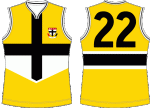
in their traditional red, white and black striped look because their colour scheme was the same as Germany’s. In 1919 this resulted in a yellow vee look that actually wasn’t bad. It’s not the best home jumper though, the traditional, three panel look is the best, there is no doubt. The 1983-96 jumper is a perfect embodiment of that look.
Worst home: For some reason, St Kilda decided to step outside of history for four years (starting in 1997) to go with a black cross, largely red jumper. This would have a been a solid away jumper with it’s contrast and look, but it should never have been a home jumper.

Best away: When the bad home jumper came into existence, St Kilda’s traditional jumper became their away jumper, so I guess that technically has to be the best away jumper. Outside of that, St Kilda have had a couple nice looks in this decade. Coinciding with a thinning of the white stripe on the home jumper, St Kilda adopted a thickened white stripe in 2009-10 for their away jumper and it is quite smart and sharp. Between 2011-14, the Saints turned that thickened white into a cross and that was a really classy looking guernsey.
Worst away: The thin stripes from 2004-06 was extremely forgettable and the 2007-08 clash jumper was too much like a training jumper. But the star of this show is the Pura Light Start yellow jumper, or the yellow peril. This was fantastic, I only hope Pura paid St Kilda bucketloads of money to wear this jumper, because there is not other explanation for it. A genuine classic.

Specials: The 2014 pre-season, stickman jumper was great. The Saints used it often at training and it may be the best training jumper in the league. Long live the stickman. The Saints have worn a couple jumpers for their New Zealand games, a hammerhead shark/stingray design – I’m not sure where the shark and the stingray are, but I haven’t studied Maori artwork – that was pretty good, and a nice, sword style white strip, with some cool artwork adorning the jumper. St Kilda’s Indigenous jumper was also reasonable, incorporating the original design well, while also stepping out quite smartly. In 2013, St Kilda celebrated 140 years of the club with it’s 1873 jumper, a red and black horizontal stripe that included scripture of every player that played at least five games. It was a solid change up, so St Kilda have a great track record on special jumpers.

Sydney Swans

Best home: When the Swans moved to Sydney they kept their red vee until 1987 Sydney-PS-1996
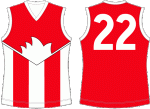
when the Sydney Opera House shadow was added. It’s a great addition. The only real change to the jumper since then change to an all red back and a wider yoke in 1992. The SMFC initials were added to the neck of the jumper in 2004 and I always enjoy those touches. With the traditional, V shaped collar, that 2004 jumper takes the award.
Worst home: While the white back is always enjoyable to see on the Warwick Capper highlight tapes, it isn’t as smooth as the all red back. The thinner red on the 1989-91 jumper was the worst.

Best away: Sydney are lucky in that until Gold Coast arrived, no other team really clashed with them. To avoid a clash with the Suns, the Swans just switch to a white back and they are fine, which keeps their away jumper in a grounded, stylish look. In 2015, Sydney have added an “EST. 1874” to the inside of the collar and as I mentioned, I like those touches.
Worst away: In 2010, Sydney sported a South Melbourne style vee on their jumper, with a club logo in the middle of it. On any other team, this would probably be the best away jumper, but Sydney’s only other look was mentioned above and it is better, so the 2010 look is the worst.

Specials: The 1996 throwback to 1905-06 braces was an improvement and the 2009 celebration of the 1909 jumper was also an improvement on the original. Sydney’s sole pre-season jumper was worn between 1997 and 98 and contained some horrible combination of the braces and the Sydney Opera House style and it was pretty darn bad. In 2003, Sydney wore a team of the century celebration jumper, with a logo reading 1874-2003, so I’m not sure what century that team was picked from, but it was okay. They also went with a horizontal red and white jumper to celebrate QBE lasting 125 years in the financial game, so well done QBE. The Swans wore a really bizarre Indigenous jumper, with what looked like Easter Eggs on the front, I’m not sure what that design was, I’m sure it has some traditional roots though.

West Coast Eagles

Best home: West Coast’s blue and yellow outfits have squandered potential to be great jumpers. West-Coast-Away-2000The Eagles wore a curtain-opening style for the first decade and a bit and while it was unique, it was a little odd. The eagle head that West Coast sported in that time was a strange outline, yet it was better than the current eagle they sport. The current jumpers aren’t bad, but they are uninspiring. The light blue look in the late 80s and early 90s was probably the best they sported.
Worst home: The original yellow back, blue shapes look was pretty average. The flying eagle from 2000-06 was terrible though, West Coast tried to get some funky colour schemes during this time and they didn’t work out.

Best away: The new eagle, old jumper look West Coast sported between 2003 and 2011 was actually a great combination. That smaller eagle is more suitable than the big one of the current home jumpers and looks sharper than the outlined yellow eagle of the original home jumpers.The current blue away jumpers, with the refined yellow shoulders and the weird eagle aren’t as good but they are passable.
Worst away: The current clash jumpers are forgettable, not offensive, but forgettable. But this section is all about the rainbow vomit that West Coast wore in 2000-02 that is just hilarious now. Where that orange/red fade came from is a mystery, the bright baby blue on the centre of the back doesn’t make sense, and why it has all been computerized together in some kind of fade is just ridiculous. A hall of fame jumper.

Specials: On the 30th anniversary of Western Australia’s stunning 1977 victory over Victoria, West Coast wore a replica jumper with the team on the back, it’s a yellow back with a black sash and it isn’t all that bad. The Eagles wore a terrific Indigenous jumper last season, with great artwork of an eagle on the centre of the jumper. West Coast have worn only one pre-season only jumper, with a weird digital design of an eagle head on the front that was a strange look. Perhaps they were trying to see whether it could work as a home jumper, but it was weird. The Eagles have also worn a 25 year anniversary scripture jumper with the names of every Eagles player on it, and a 20 year anniversary guernsey to celebrate the 1992 premiership with the team listed on it. Highly forgettable, both of them.

There you go then, thanks for sticking through all of this and I hope your team was treated properly. If you didn’t check out part one, you can here. If you want to know the top five worst jumpers of all time, click right here.

The best and worst jumpers of every VFL/AFL club, part 1

Following on from my ranking of the best nicknames in the current AFL system, it seems only logical to focus on even more trivial aspects of our game. Outfits have varied significantly over the 157 odd year history of Australian Rules. In early park matches held in Melbourne, teams often were only distinguished from each other by cloths of different colours, tied to their upper arms. As the game and clothing developed, jumpers went through lace ups, long sleeve only woolen jumpers and today’s polyester, generally sleeveless outfits.
During this time, every team has worn some great jumpers and some shockers, so it’s about time somebody had enough spare time to rank the best and the worst of each team. Part one and two (yes, I really have that much time to waste) will include the best and worst from home jumpers, away jumpers and any notable special jumpers. Special jumpers include heritage rounds and promotional jerseys.
Obviously, some teams will have more outfits to choose from than others. Clearly Melbourne will have a larger selection than Greater Western Sydney. That’s just how it is, and it means that, generally, newer clubs will have better worse outfits. If that makes sense. Also, as general rule, lace up jumpers have to be ghastly or glorious to be included. It’s hard to judge a jumper that can break in two, so they will be ignored more often than not. For arguments sake, Fitzroy, Brisbane Bears and Brisbane Lions will all get separate sections. Sydney and South Melbourne will also be split.
Unfortunately, University only had one jumper, so they don’t get included. State of Origin teams are not included, but who knows, that could be a companion piece in the future.
This is all my opinion. If you disagree with it, which I’m sure you will, let me know in the comments or at my Twitter. Nothing like a Twitter debate about footy jumpers. Also, this isn’t a ranking, it’s just in alphabetical order.
Now that nonsense is out of the way, it’s probably time to get started. About 99% of the research into this was conducted on the unparallelled footyjumpers.com. If you have a few spare dollars, feel free to donate to them. They’re really great.

Adelaide Crows

Best home jumper: When it comes to home jumpers, Adelaide have been pretty dull.Adelaide-PS1 They’ve stuck to the red-yellow-blue stripes throughout their existence, and it makes sense. It’s the South Australian colours and it’s not a bad jumper. Unfortunately, it makes things very pedantic when separating best from worst. The 2004 look featured a simple collar and avoided trying to be too showy, which came about in later years.
Worst home jumper: I’m not exactly sure what the Crows were thinking with the 2009 jumper. There is a square on the front for no real reason, and the red hooping style seems unnecessary. Don’t mess with a good jumper for the sake of it.

Best away jumper: The original away jumpers pulled off the often difficult task of reversing colours on a jumper. From 1999-2005 the Crows wore a similar jumper to home, except with a red upper half and a black crow on the centre of the front. Recently, with clash jumpers becoming important, the Crows have gone all white with their away jumpers, which is a shame. The 2003 away jumper is classy, with the old style number back.
Worst away jumper: As mentioned above, Adelaide has become white to provide more of a clash. This makes sense, but doesn’t mean the jumpers look great. The 2015 away jumper features claw marks, which never works out well. However, the worst is the 2009 jumper. 2009 wasn’t a great year for Adelaide design, and this cartoonish crow with a strange red/yellow pattern just seems a bit silly.

Special jumpers: The 2006-07 heritage jumper was a really good example of a team taking a risk on design and it coming off. Featuring SANFL teams in a strip on the left was an inspired choice. It adds history and doesn’t make the jumper awful. Adelaide have only had one pre-season jumper, and the reason why is because it stinks. It must have formed the basis for the 2009 away look, why they brought it back in 2009 will forever escape me. The back is even worse in the 1996-98 version. Yuck.

Brisbane Bears

Best home: The Bears had a comical tenure in the league. They didn’t get a lot right,Brisbane-1987 and their jumpers never really hit the mark. The collared look from 1992-95 was a simple use of the Queensland maroon (it’s really cerise, but they need a break), and if in doubt, a V always creates a passable jumper.
Worst home: This comes down to two options, the inexplicable poo brown of 1987-88 or the cerise version from 1989-1991. The pyramid logo probably wasn’t a great choice in the peak days of the pyramid scheme, and the line from the logo around the back was just silly. Poo brown never looks good, so 1987-88 is the worst.

Worst away: The Bears away jumpers consist of a reversed version of the 1987-88 and the 1989-91 jumpers. There are no best jumpers here. For judgement sake, the poo brown loses again.

Specials: If only the Bears were around in the more promotional era we live now. I’m sure they could have concocted some shocking XXXX Gold jumper. Alas, the Bears didn’t have any promotional outfits.

Brisbane Lions

Best home: When the Lions merged with Brisbane Bears, they thankfully got rid of the cerise.Brisbane-Clash-2006 There have basically been two BL jumpers; old lion and new lion. Old lion is infinitely better. We are talking 1991 Brisbane Bears compared to 2002 Brisbane Lions infinite. Mark McKean the captain compared to Michael Voss the captain infinite. In 2002 they added the BBFFC insignia to the back of the jumper, and that is a touch good enough to earn the best jumper.
Worst home: Man, that new lion really was a stinky idea. It was introduced to match the new Brisbane Lions logo. A choice that – while not as bad as the live lion at games idea, or the Voss quick rebuild centered around Brendon Fevola idea – ranks amongst the worst at that club in the past decade. The jumper was introduced in 2010 and removed for this season.

Best away: Since away jumpers have generally been a thing only in this century, that infamous new lion looms large over the BL away jumpers. The white away jumper from that period is actually kind of decent, and deserves some praise. The throwback Fitzroy-red guernsey is the finest, but it isn’t all that different from their regulation home jumper.
Worst away: Amazingly enough, this involves the old lion. Having an icon split its time between the front and the back of a jumper never looks good, least of all when it is a bulging maroon monster on a yellow background. I can only assume this sold enough copies in the merchandise store for it to be brought back for 2006, because I don’t have any other reasons.

Specials: Brisbane Lions for one thing, always nail heritage jumpers. Their really old, Fitzroy Gorrillas style from 2002 and 2005 were excellent, their 2007, 1970s throwback was great too. They even managed to improve on the Bears pyramid logo, it’s not great, but it’s an improvement and the hall of fame jumper was great too. Way to go Brisbane Lions. Points for effort and cause with their Army style guernsey, but they didn’t quite pull it off.

Carlton Blues

Best home: Carlton have had only one jumper in their history that wasn’t plain navy blue.Carlton-MM-1997 From 1897 to 1913ish they had a cream upper third that was actually kind of nice. But they are the Blues for a reason, and the only way to distinguish jumpers is by the insignia on the chest. Between 1909 and 1927 Carlton experimented with various fonts and styles for their CFC. The last of these was probably the best, emerging in 1926. There is a reason why the 1927 insignia was voted back in to the modern jumper by the fans last year. It’s classy, it’s classical and it is very blue.
Worst home: As mentioned, it is hard to pick the worst when all the jumpers are so similar. The Blues had a small number situation going on in 1911. It’s a little harsh, but that is the worst they have had.

Best away: This is split in two. The colour flipped, all white version is actually not bad. The 2015 version has enough sneaky dark blue and the older logo.
Worst away: It’s the sky blue. Despite some derogatory feelings in the football community, the sky blue isn’t an abomination, but it isn’t good either.

Specials: Carlton has a great history with random jumpers. In 1900 they wore a Union Jack on their back during a Queens Birthday uniform and in 1914 they had a sash against Fitzroy for clash reasons, both very silly jumpers. Their sky blue M&M promotion uniform in 1997 was one for the ages, while they wore an all yellow guernsey in 2009 with Lance Armstrong’s pre-disgrace signature on the front, both wildly contrasting outfits. The heritage jumpers they wore in 2003 and 2004 were winners though.

Collingwood Magpies

Best home: Firstly, yes, there is a difference between black on a white background and white on black background.Collingwood-PS-1996 If you thought this piece was childish and far too detailed for its subject, you haven’t seen anything yet. From 1897 to 1975, Collingwood jumpers had black outsides, so I’m claiming them as white on black. From 1976 to 2000 Collingwood was black on white, with the only alterations being on the back and with the collars. This century Collingwood has switched to white on black, in a darker more villainous look. I prefer black on white, maybe that is a by-product of being raised with white on black and pining for a more heritage look. The 1988-97 look, with thinner stripes and a normal number on the back is the best.
Worst home: I don’t know, the round collar on the 2013-now jumper looks a bit silly? Round collars generally aren’t great, so, yeah.

Best away: Don’t let the publicity fool you, Collingwood have had away jumpers. From 2011-12 they wore a black jumper with only two white stripes.
Worst away:
From 1998-2000 they wore a dark jumper with a magpie logo on the chest, from 2002-04 they had a swooping magpie descending towards the stomach The 1998-2000 look wasn’t great, the traditional style number crest doesn’t come off here.

Specials: Collingwood heritage jumpers really aren’t a story (because the rest of this is!), but they have put in a couple interesting promotional jumpers. The Magpies wore a pre-season jumper between 1996-97 that is really bizarre. A cartoonish magpie with some sort of barcode background? Did anyone think that through? In 1982 Collingwood played against Swan Districts in the 1982 Escort Cup, a fascinating night time competition. Perhaps because they weren’t the McGuire superpower/overlord they are now, Collingwood wore a Melbourne-style guernsey to avoid a clash, as they played away. It doesn’t look too bad. Their 2014 Indigenous Round jumper was subtle and stylish as well.

Essendon Bombers

Best home: Even Collingwood had more variety than this. Red sash on black background.Essendon-TAC-2010 In 1918, Essendon thickened the sash, and in 1975 they thickened it again for television. For some reason in 1897 and 1909 players were allowed to decide which side they put the sash on, or their mothers or their brothers decided or whoever. I’m a sucker for the collar look from 1918-1974, it’s very historic.
Worst home: After 2011 the sash was straightened. Not sure why, but it is far less artistic. The 2015 jumper added a red slip to their collar, probably just to be different and sell more jumpers. It isn’t an improvement.

Best away: Essendon have never worn an away jumper for away purposes, only a clash jumper. The best guernsey widened sashes. They aren’t great, but these days clash jumpers are essential.
Worst away: Technically Essendon are trying to pretend their grey jumpers are heritage jumpers. There is no precedent or explanation for it, but they are clash jumpers. And they suck.

Specials: Their heritage jumpers aren’t anything to write home about, but they have had a couple of smart promotional guernseys. In 2013, Essendon celebrated 140 years with a jumper featuring all their faded logos on the sash and player names over the black. It’s a subtle throwback and it is nice. The TAC promotional jumper is perhaps the best example of using the jumper to tie into the promotion. Using the sash as a seatbelt was a genius idea, bravo.
I’ve had to back track to Essendon on account of the new release of the 2015 Anzac Day jumper. It’s excellent, the number of poppies signifying the lives lost, the names on the jumper and the smaller sash are all smart and in good taste. Well done.

Fitzroy Lions

Best home: This is tough, I really like all the Fitzroy jumpers. Maybe it is because they aren’t around,Fitzroy-Preseason-1995 and I have always thought of Fitzroy as this kind, underdog team. It would be fun to go to a Fitzroy game because you would win, their fans would be polite and they would have a certain poor little kid charm about them. Through their history they moved from all maroon to maroon with a blue yoke to maroon with a lowered shoulder blue and then red and blue for television. All the jumpers are great, but in 1956 the Lions changed their insignia to white and that is the most attractive.
Worst home: From 1908-11 Fitzroy were just plain maroon with blue cuts. That’s a pretty dull jumper, so it has to be the worst.

Specials: Fitzory weren’t around for away jumpers, so we’ll skip right ahead. They only really have two options for special jumpers, a heritage one in 1996 that isn’t all that bad and a pre-season jumper from 1995-96 that is outrageous. That is a top five worst jumper.

Fremantle Dockers

Best home: In 2011, Fremantle took inspiration from a heritage jumper they wore (more on that later),Fremantle-3 and changed their jumper to a purple back with three white vees down the chest. As far as purple and white jumpers go, it’s about as good as it gets.
Worst home: Look, the original anchor look wasn’t that horrible. It was just busy. I liked the anchor, it was a great throwback to the actual dockers, but the three colour background wasn’t ever really going to work.

Best away: While the current reversal for an away jumper isn’t bad, the purple anchor on a white background is excellent. As mentioned, the anchor is great historically and the purple on white is just subtle enough to be a really great guernsey.
Worst away:
I’ve been kind to Fremantle so far, but that is over. Green jumpers don’t work so the original green/purple/anchor away jumper isn’t any good. The vertical stripes with an anchor was terrible. But the 1998-00 away jumper, featuring a 3D anchor and a 3D  crest for the number is really, really bad. It’s on the edge of the top five worsts.

(Note: I missed the ‘Specials’ section for Fremantle in the original post. This section has been added in two weeks after the original post)

Specials: The Dockers have worn some interesting heritage jumpers. They wore a Sydney-style red and white style in 2003-04 of vee’s which led the the current home jumper. It’s not bad. Fremantle wore an interesting blue and white vertical thirds jumper, based on East Fremantle’s look from the 1970s in 2007 that is also a better jumper than the original home jumper. The Dockers have gone with the same Indigenous jumper in the past two seasons, and it is a nice incorporation of the home jumper, by replacing the vee’s with boomerangs and the Aboriginal artwork is subtle, yet stands out. It’s a good look.

Geelong Cats

Best home: Like most of the original teams, Geelong haven’t changed their look all that much.Geelong-150-2009 The number of blue hoops on a white background and collars are the only real variables. In 1919 the Cats went to their more modern look of thicker hoops. This is going to be a rare distinction, but the 21st century look is actually the finest. In 2010 Geelong went to a wide neck and it is quite nice.
Worst home: With respect to the strange white collar of 1975 and the weird round hoops of the original jumper, the worst jumpers were worn from 1908-18. They were bib style, with the players often wearing shirts underneath their jumpers.

Best away: Geelong has had a torrid time trying to find a decent away jumper. The 1999-04 away jumper period excepted, all the jumpers have been for clash reasons. The last two jumpers they have used, in 2013 and the current one, are the best. I’m not sure the current one is enough of a clash for its use, but it looks the best.
Worst away: A lot of honorable mentions here. In 1914 and 1921, Geelong wore a plain blue jumper for clash reasons, in 1998 they again wore a very blue jumper that was removed because it looked too much like Carlton and in 2007 Geelong went for an ill advised claw-tear jumper, a design that never really works. In 2008 the Cats tried to incorporate their new logo into their clash jumper, which was just silly, and they followed that up with faded white stripes from 2011 to 2012, not sure what the thinking was there either. The biggest debacle was in 2003 though, where Geelong wore a clash jumper against Collingwood that was shelved because it looked too much like Collingwood’s guernsey, I guess completely forgetting what happened five years before. For sheer stupidity, that is a highlight of this piece.

Specials: Much like the away jumpers, the Cats have been hit and miss in specials. their best heritage jumper was from 2005, a jumper that wasn’t really heritage at all. Their team of the century jumper was very blah, and the 2010 jumper to celebrate 85 years of partnership with Ford was a worse version of the 2008 clash jumper. In 2009, Geelong celebrated 150 years with a classy scripture jumper of players names, it is perhaps the finest scripture jumper seen in the AFL so far, a smart incorporation of the actual jumper. In 2013, they followed it up with a reversed version under the guise of members appreciation for those who paid to have their name on the jumper. A bit of a cash cow idea, but visually it is a very nice look.

Gold Coast Suns

Best home: As I mentioned in my piece about nicknames, the Suns are blessed with a great location and an almost unfailable outfit. Gold-Coast-Indig-2014They’ve gone with a basketball-style logo on chest instead of the historical patterned design. It’s a sound and a solid combination. The Suns have only had two home jumpers: a duller and a brighter one that came into being in 2013. The brighter one wins, I guess.
Worst home: The dull one, keep up.

Best away: Gold Coast flirted with a wave design on their away/clash jumpers in the beginning, and while it didn’t fully come off, it was a worthy attempt. They’ve currently gone with a more subtle design, with a kind of blue/yellow crescent and a white background. It’s not perfect but it’s fine.
Worst away: As mentioned, there wasn’t anything completely wrong with the wave design, it just didn’t quite come off. The blue and white one missed by the farthest.

Specials: Gold Coast have only had three specialized jumpers: a 2011 founding donors thank-you, a 2013 founding members thank-you and the 2014 Indigenous jumper. The 2011 one is just a normal jumper with names, nothing to write home about. The 2013 jumper put in a cool, lifesaver looking logo that they should feel free to use again. The Indigenous jumper is excellent, again incorporating the sea, sand and sun, it’s a joy to look at. I really have come off as a Gold Coast lover here haven’t I?

Alright then. We are halfway. There are 11 teams to come, part two is right here when you want to look at them.
Also, the top five worst jumpers of all time is here.

The Definitive AFL Team Nicknames List

tiki-download_file.php

Cartoon originally published in The Argus on 23/4/1938

Essentially everything in life needs a ranking, and AFL nicknames aren’t any different. After undeniably being inspired by Zach Lowe’s NBA team name list, it was clear the AFL was missing a list. While our game doesn’t have such a collection of random anomaly names as you will find in the American system, there is still a collection of interesting nicknames on our shores.
This ranking – which I can tell you already disagree with – takes into account history, mascots, alternatives, team song, logo involvement and even guernseys. Of course there will be reasoning provided, but it is a 3500 word exercise about nicknames. It’s incredibly silly.


18. Greater Western Sydney Giants

Look, history does matter. Particularly on this one. The Giants is a nice, safe option and without any history it suits reasonably enough. The idea of the AFL Giants towering their way into Sydney to crush Rugby is a nice image, but without GWS actually being good it doesn’t stick that well. The Giants is nice sneaky alliteration with GWS and if they had picked a name with an extra syllable it could have got nasty. Imagine fitting the Greater Western Sydney Conquerors or Enforcers or Money-Grabbers in a small space. Actually, Money-Grabbers might have been the best option.
At the time, potential fans were given a chance to vote on a nickname  – Giants (spoiler: winner), Rangers, Warriors or Wolves (also, check out the options provided by The Age in the link above. Pride? Stallions? Rams?!?!). All three other options would have been far superior for fun. The Greater Western Sydney Warriors getting mixed up with the Golden State Warriors – GWS Warriors vs GSW – would have been fun enough. The Rangers is so ridiculous is would have worked and the Wolves makes almost as much sense. May as well have been Foxes.
The Giants is safe, it allows for a big G on the front of the jumper and it’s not horrible. That’s all a bonus for a start-up team in an area that is devoid of football history.

17. Western Bulldogs

The Scraggers, Tricolours, The Imperials, The Scray. These alternates are interesting. Particularly Tricolours as an off-beat classical nickname would have been a fancy name that doesn’t fit the area at all. The Scray is pretty hip and makes for the perfect pub name. These next three alternates may be the best of this list. Saltwater Lads just makes so little sense it is so fun and The Bone Mill Fellows carries both an air of intimidation and a collection of park footballers. Men From The Land Of Boulders is beyond a nickname, or a pretentious film title, or a strange super-hero team up. Imagine preparing during the week to play the Footscray Men From The Land Of Boulders. They wouldn’t even be human, they would just be a collection of Yeti and Bigfoot and Abominable Snowmen dressed in Tricolour. If only. Popular history has it that a bulldog literally led the team out one day and the nickname stuck. An unlikely story and not that exciting. There are better places to demand a return to the Footscray Football Club, but the Western Bulldogs just doesn’t work. At least the Dog is off the jumper now.

16. Hawthorn Hawks

Luckily Hawthorn have been reasonably successful over the bast few decades, because they struggle in the stuff that really matters. Their poos/wees jumper aesthetic is just about as bad as it gets and the Hawks are a nothing nickname. Sure Hawks are predatory birds and all that, but there is little history behind it. Apparently, after being called the laughably inoffensive Mayblooms, then coach Roy Cazaly’s daughter suggested the more ferocious Hawks as a nickname. It’s a nice story but it doesn’t take away from the fact they should be the Mustard Pots. Even had they changed their name to Commandos after John Kennedy’s tough team it would have been better. The Haw-Haw sound is a bonus, but it doesn’t lift it that far on this list. Luckily, Hawthorn has enough on-field success to forget about their other issues.

15. North Melbourne Kangaroos

Truly, North Melbourne are the Shinboners. They recognize as much, but Shinboners is hardly going to attract young families to a historically struggling club. Kangaroos is a simple and safe nickname, there is nothing awful about it but it is so generic it can’t go any higher on this list. In the 1950s president Phonse Tobin was inspired by a large kangaroo he saw in a shop front, a kangaroo is the most universally Australian animal and is a perfectly adequate way to appeal to Australians who aren’t natural footy supporters.
Things were worse when North were known simply as the Kangroos, but this nickname doesn’t seem to have any local anecdotal roots. It’s been around for a long time but it’s always easier to just go with Roos.

14. Port Adelaide Power

This is a tough one. Port Adelaide was formed at a football club in 1870 and as far as everybody was concerned they were Magpies for another 127 years. Upon winning a license to enter an AFL team Port had to come up with a different nickname and they went with the Power. It’s not totally clear why, and through about 15 minutes of hard research it was difficult to find a reason. The best I found was in the famous creed, where Fos Williams implores the players and administrators to “strive with all our power to further this club’s unexcelled achievements”. If this is the reason, Power is actually a pretty savvy and wonderful nickname. It is an unexpected blend of history and try-hard coolness.
Before stumbling on this nice – and possibly irrelevant – fact, Power was looming as an awful nickname choice. It just screams lame mid-1990s desperation to be cool with the new millennium ahead. And those lightning bolt jumpers weren’t helping, but this isn’t as low on the list as it could have been.

13. Gold Coast Suns

The longer the Suns are around the more it grows on me. A perfect encapsulation of the atypical Gold Coast picture, Suns are a perfect choice. While an inanimate object, Suns works in that it can be devised to be anything. Also, given that you aren’t supposed to look directly at the sun, it was a great representation of the team in their first couple of years. Again also, it provides just enough of a tongue twister to work well alongside Karmichael Hunt.
The nickname didn’t help avoid a typically lame mascot, but it certainly is better than the alternatives. The only other real alternative thrown up before the 2011 season was the Lifesavers (I’m not sure which one) and that would have been the best way to create a joke of a team. Perhaps the Gold Coast Schoolies would have been better, but we can’t have everything. Suns is a simple, smart nickname. No glaring faults here.

12. Essendon Bombers

After shaking off the Same Olds nickname, Essendon were simply the Dons and in truth they probably really are still the Dons. Following their close proximity to the airport during World War II they became the Bombers and it has stuck. There have been multiple calls for Essendon to remove the nickname in light of its war resonance and frankly it might only still be in place because it is the team song. It isn’t truly offensive but there is some sour taste in there, however it is intrinsically linked with the club.
The plane motif has led to a couple of solid logos, the paper plane logo from the 80s is always enjoyable. But there aren’t many from that time that aren’t winners.
The almost unrelated mascot is one of the few good ones around, based from the famous “Mosquito Fleet” team of the 1920s, Skeeta has endured to remain a winner. Skeeta wears bomber goggles and his wings give him enough flying to be bomber enough. Long live Skeeta.

11. West Coast Eagles

This is one of those random insignificant nicknames that just works. West Coast are the Eagles and it fits nicely. It allows for easy mascotting and can result in some simple, eagle-themed jumpers. It has also resulted in a shocker or two. I’m not sure whether there were many considerations for other nicknames when the WEagles came to be in 1986. The Western Australia State of Origin team were the Sandgropers and it would have been unfair and poor to take that name. Black swans are an emblem of the state but with the other swans hanging around it would have been too confusing. The Eagles are a good fit for a team with no history, but the rock song taken from it needs serious work.

10. Melbourne Demons

The popular alternate name – Redlegs – was preceded by the Fuchsias, which is just awfully appropriate for the modern Demons. According to legend, Frank ‘Checker’ Hughes introduced the Demons as a nastier nickname. One day Melbourne was struggling and Hughes told his players “You are playing like a lot of flowers! Lift up your heads an play like Demons!”, and they probably did. Redlegs is a great secondary nickname and Demons is threatening enough to be feared, but the lack of intimidatory play from Melbourne helps it avoid being cocky. Demons lacks good reason, much like Roy Cazaly’s daughter picking Hawks out of the blue, Demons being chosen virtually at random by a coach downgrades the value. In general though it is a solid nickname and results in nice “Go Dees“.
In other areas, Melbourne have really struggled to make use of the name. Their away jumpers in the 2000s that featured demon faces were ridiculous and they somehow pulled off the rare failed logo from the 1980s. Even their current logo tries too hard. The southern cross? The trident? The flame above the letter M? Even the football in the centre and the writing behind just seem completely unnecessary. Oh well, one day Melbourne will get something right, they have to.

9. Brisbane Lions

Let’s get rid of the Bears business quickly. They were named the Bears and fronted a koala emblem, because maybe Christopher Skase thought koalas were bears? I don’t know. Their outfits were gross and they were no good. Enough.
After passing between the Maroons and Gorillas (how un-Australian is the Fitzroy Gorillas? Obviously they took that name because of the popularity of King Kong), club officials went with the Lions in 1957. It is a great nickname, regal, powerful, threatening. The Lion on the ball is a wonderful logo. The strange new lion they have on the front these days is far too paddle-poppy, but there is little wrong with a strong nickname like the Lions.

8. Fremantle Dockers

To my horror, preparing to write this piece I learnt for the first time that Fremantle were not officially the Dockers between 1997 and 2010. I’m almost too flustered to keep doing their section. Anyway, the story goes that Fremantle were stricken of their nickname because Levi Strauss & Co. manufacture their own clothing line called “Dockers” and weren’t willing to give away their brand to some lousy football team (they really were lousy at the time). Until 2010 Fremantle were just Fremantle, which I struggle to believe, until they struck a deal with Levi Strauss to pay them a measly $1,000 a year for use of Dockers. I am incredulous at my lack of knowledge here.
On to the actual nickname, it is terrific. A bonding appliance between Fremantle supporters, their blue collar history on the water and their modern white collar supporters whose father or uncle or aunt worked on the docks, so they try to cling to that workman history. Unfortunately it resulted in anchor obsessed jumpers, until they moved to the excellent purple number they currently sport. Nothing can be done about the surfer mascot though, I’m not sure which version of Johnny ‘The Doc’ Docker is worse; the bizarrely emo version or the Lisa Simpson haired mess.

7. Geelong Cats

Ten years ago this was the perfect nickname. A playful, yet nonthreatening team, the Cats were fun to watch every now and again, but they always ended up napping at some point. Then Geelong became good. Cats suddenly seem to weak for such a dominant team, but there is no changing it now. It fits in with the town, just like the team, and there is no Geelong without the Cats.
History wise, the origin of the nickname is a semi-interesting story. After struggling through the 1923 season Herald cartoonist Sam Wells suggested the Pivotonians ( a nickname based on Geeelong’s strange early town nickname of The Pivot) needed the presence of a black cat to turn around the fortunes of the team. Not long after a black cat entered the field of play during a game, a game that would break the losing streak for the team.
The team mascot; Half-Cat has defied the modernisation of mascots and remains a strange-looking fan favourite, which adds to the charm. The modern logo does a surprisingly good job of involving the blue and white stripes whilst not involving a horrible cat face.
The Cats fits well with Geelong. Alongside many of the names in the lower half of this list, the Cats has become a definite part of history of the team and competition.

6. Sydney Swans

The famous Bloods nickname actually comes from Blood Stained Angels.
Tell me this wasn’t a 1993 Steven Seagal action movie set in Los Angeles where Hank Steel (Seagal), a retired secret service agent, returns home to find his wife (Alicia Silverstone) has been murdered by the local mafia as revenge for a hit he made while he was in the business. Steel returns to action to take out the mob because sometimes, in the City of Angels, the angels are stained with blood.
Anyway, much like the Shinboners, the Bloods needed a more savoury nickname and via a combination of a number of Western Australian players in the team and their proximity to Lake Oval (which is the home to an obvious bird), South Melbourne became the Swans. It’s a great nickname. A Swan is regal enough to instill pride, yet ferocious enough to not be a joke, and it has local history, plus the double ‘s’ is always important. This marks a great match between the Swans positive culture that ties in with their lovely theme song, as well as the deep seeded aggression of the Bloods and the sudden antagonism Lance Franklin has brought to the team. Importantly the Swans sits perfectly with the Sydney Opera House theme on jumpers and logos, which has successfully combined the Swans and Sydney in recent times.

5. St Kilda Saints

For some reason, St Kilda tried to fight their natural nickname in the past. For a period of time there was an association with Seagulls, and there was also a bizarre push to go with the Panthers. Seagulls kind of makes sense due to the location near the sea, but these flirtations with nicknames when there was a perfectly good one in there anyway doesn’t stand to reason. Why anybody watching a St Kilda game would ever cheer for Panthers or Seagulls doesn’t make any sense. Plus the Saints is alliteration, and that gets serious points in this list.
The Saints, a good-natured, runners-up team that never really wins, is great for St Kilda. They are a nice, inoffensive team that you wouldn’t necessarily like to get stuck with for three hours. Their The Saint style logo was spectacular, and their new training guernsey is a very welcome look. The Saints have actually had a pretty good history with their jumpers. After abandoning the yellow in their club following German association in the early 20th century, the three pannelled guernsey is a good mainstay. Even the red soaked late 90s look wasn’t the worst of the era, but it is hard to forget the eternal Pura Milk jumper. Even the incorporation of the cross on the current away jumper is a success. Keep it up Saints, you lovable losers.

4. Carlton Blues

Carlton has the final nothing nickname. Aside from sporting nicknames has anything ever been called a blue (aside from this guy)? It makes little sense and leaves no room for a good mascot – but the athletic Captain Carlton isn’t bad. It is probably just the weight of history, but the Blues just fits. The heritage value of the Blues running out in their classical guernsey works beautifully for football.
Generally Carlton have been the Blues since the 1870s when they added a blue cap to their attire. Their plain outfitting drew a nickname of Butchers for some time before that. There was some media talk about the Carlton Brewers before World War I, which is a fantastic reference to the Carlton and United Brewery. Cockatoos was brought up after the Second World War, probably as a result of the terrific story of Cocky Marr. Cocky was a cockatoo who watched Carlton games from the outer at the time and was renowned for being a loud supporter.
M&M jumpers aside, the Blues are the Blues and there is nothing wrong with that.

3. Adelaide Crows

This one sits perfectly. The South Australian football team was known as the Croweaters, as to where this term came from, it’s not entirely clear. One theory is that as a bunch of South Austalians made their way across the desert to the Victorian goldfields in the 19th century, they began to run out of food. As a result the travelers were forced to shoot and eat crows, a misfortune that the ever-accomadating Victorians didn’t let them forget.
South Australia ended up embracing their name and it applied to their football team, so when they formed their own team in the AFL the Crows was a natural nickname. It works, nobody likes crows except Crows supporters (something you may see later in the list) and it is perfect for their stance as undeniably anti-Victorian.
Adelaide have had some interesting off-field marketing grabs; the Camry Crows, the inexplicably lame ’19th man’ campaign and now the media’s own Adelaide Crow-val, but their nickname and jumpers have remained really solid. Their regulation jumper; which makes use of traditional South Australian colours is terrific, and their logos (before the painfully plain modern one) using those colours were amongst the best in the league. For a while even their away jumpers worked well with the Crow and the colours, this is a nickname done right.

2. Richmond Tigers

Falling just short, but not ninth, is Richmond. Tiger fans can consolidate themselves by singing along to the best theme song in the league, but they shouldn’t be too upset at having such a quality name. The Tigers are ferocious, and relentless on their attack on the ball and the man. Nobody wants to be stuck with a tiger for opposition, at least they didn’t in the glory days. The incorporation of ‘Tiger Time!!!’ carries its own special weight and there is nothing quite like the feeling inside the MCG when the Tigers are in top form, they carry their own special type of rumble.
Origin wise, the Tigers were once referred to as the Black and White Angels. Why, I don’t know, but Steven Segal would have had a say. There was a small push to have them as Wasps for a period of time, likely based on their colour scheme. The story behind the Tigers is loosely attributed to a mysterious ‘Mr. Miles’. Miles, a big supporter of Richmond, often couldn’t afford to get into Punt Road so he would sit himself in a tree to watch the game. Miles would roar from the tree, “Eat ’em alive Tigers”. He took tigers from the colours of the jumper and his cry stuck with supporters.
Richmond’s logo work hasn’t worked out as well as their name. Their two logos (here and here) from the 80s failed to impress like others have, mostly because they didn’t know what to do with the tiger. The MGM-inspired 90s logo certainly wasn’t the worst though. The Tigers is as close to perfect as a nickname can be, it’s glorious and smart.

1. Collingwood Magpies

Magpies are as Collingwood as anything can be. An absolute nusciance that will come and swoop you, magpies are hated by everyone, which makes them perfect for Collingwood. The club has long embraced their antagonistic role in the league, much like the Crows, their aggressive nickname has propelled that somewhat.
Despite brief flirtations with being an accommodating member of the league regarding alternate jumpers, Collingwood are Collingwood and they don’t wear clash jumpers. Their logos have been near perfect, with a simple, classical design followed up by a flawless current logo. You can say bad things about the Magpies, but they do these things well.
Historically speaking, Collingwood have always been the Magpies. A large group of magpies had territory just outside Victoria Park many moons ago, the jumper design was a perfect fit and the club motto translates to “May the Magpie prosper”. Collingwood are the Magpies, as much as everybody else hates them they will forever be the Magpies and they hold the best nickname in the competition.


Further information for this that is not hyperlinked was gathered from 100 Years of Australian Football, specifically page 159; written by Col Hutchinson.
Most jumper/logo images were retrieved via footyjumpers.com.

Reliving one of the greatest AFL games ever

The upcoming round 14 of this AFL season marks the five year anniversary of what can be argued as the greatest home and away match of all time. Famously known as “the unbeatables game”, St Kilda and Geelong faced off in a top of the table clash; both teams entered the match with 13-0 records. The match, along with the 2009 Grand Final between these two teams, marked the crescendo of a ten year rivalry. A rivalry that Geelong would undeniably end up having the better of, even if they didn’t win on this day.

This match was, as Joel Selwood put it in a recent AFL feature, “both sides in their peak and both sides had been compared to each other for so long”. In earnest the rivalry between the Saints and the Cats began with the new millennium, when both sides were stocking up on young talent through the draft. St Kilda had a slew of high picks thanks to years languishing down the bottom of the ladder, while Geelong followed up a first round exit from the finals in 2000 with multiple seasons dedicated to player development. With interstate sides dominating the early 2000s the Saints and Cats became front runners to bring the premiership back to Victoria, and the Cats did it in 2007.

A spiteful 2004 pre-season final, in which St Kilda joyfully took the cup elevated the rivalry as both teams went on to play in tight, but lost preliminary finals that season. Geelong lost form until their spectacular premiership season in 2007, while St Kilda plateaued until Ross Lyon took over as coach in that year. Following their heartbreaking loss in the 2008 Grand Final the Cats were determined to claim a second premiership in their era, while the Saints were successfully implementing a forward press the game had never seen. Both teams were undefeated by round 14, marking the latest such meeting between undefeated teams in AFL/VFL history, the Docklands stadium was sold out with 54,444 fans packing the venue; still an AFL record for the stadium. The time of the match was put back an hour so Channel 7 could telecast it live as a lead in to their news, the stage was set for an epic encounter and for once the game lived up to the hype.

The Saints were generally considered the contenders to the Cats champs, it was the contenders who got the jump. Clinton Jones kicked a celebrated taggers goal and Nick Riewoldt took a typically courageous mark back with the flight on the goal line. Following Sam Fisher’s quick goal, the Saints led 31-1 and the match for the ages appeared headed for a blow out. Gary Ablett got Geelong on the board, but St Kilda’s frontal pressure was immense and completely stifled the Geelong quick movement.

In a surprise move that was never really repeated, Darren Milburn snuck forward to kick three goals, starting in the second quarter, while Jimmy Bartel held on to a screamer of a defensive mark as he compiled 37 touches. Michael Gardiner took a big contested mark in the third quarter – nearly knocking out Justin Koschitzke again – in a sign of things to come. Gardiner converted his shot at goal to push the Saints lead to 21 points, but as only the Cats could do in those years, they reeled off three goals in three minutes to make it a one kick game.

The second of those goals; Cameron Mooney’s 55 metre bomb resulted in Dennis Commetti commenting on “the roar” and it seemed like the roof was ready to burst. The Docklands was packed like never before and they knew Geelong was coming when Mooney converted from Matthew Stokes’ unbelievable pass. Selwood, noticeably fresher faced than now, dribbled a through a goal 20 seconds later and the champs were awoken. A tentative seven minutes followed before Riewoldt burst the ball with a 60 metre goal on the run to give St Kilda a 10 point lead.

Lenny Hayes, amid a typically workmanlike 33 possession performance almost knocked Koschitzke over with a bullet pass, which he turned into a goal from beyond the arc. Young Shame Mumford handballed one into Harry Taylor’s foot deep in defence, which resulted in another Gardiner goal from 15 metres out, a spot he would revisit later. The Saints suddenly held a 23 point lead, which appeared enough. It wasn’t, but it was.

Max Rooke snapped truly from 40 metres, Paul Chapman – who had a game-high 39 touches – torpedoed one as a result of another back with the flight mark from Bartel, that somehow bounced through eight players for a goal and Mooney slammed through another long set shot. The margin was under a goal again. This was footy under the dome as it was supposed to be. Fast paced, highly skilled and inside a stadium that was threatening to jump from it’s foundations. Corey Enright describes the game as “really fast and really brutal’, and it is hard to argue.

With eight minutes to go St Kilda broke free thanks to Hayes and Riewoldt found Stephen Milne in space 40 metres from goal. The Saints opened up their forward line with numbers at the contest, a trademark of that era for them. Milne’s floater somehow cleared Mumford on the line to give St Kilda breathing space. Geelong slipped through the tight zone to find Milburn who brought it to six points.

As the five minute mark ticked by, Stokes found himself in inexplicable space in the forward 50 and converted. With five minutes to go, scores were level. Perhaps the unbeatables would remain so. The final five minutes was played almost exclusively on one side of the ground as both sides kept banging on a door that would not open. There seemed to be no space at either end, but the wing was as open as ever as each team turned it over at their half forward line. Joel Corey received a free kick was was given as advantage, a decision that even confounded everyone in the stadium, including the broadcast vision.

Despite an overly ambitious bounce on the run from Zac Dawson, St Kilda managed to finally break the pattern and switch the play to the broadcast side and Luke Ball came off the bench with all the time in the world. Ball marked the ball on the wing and played on. Gardiner and Mark Blake stood side by side on the 50 metre arc. Ball took seven steps and launched the ball to the goal square. Gardiner kept coming. Milne and James Kelly wrestled, Riewoldt and Taylor came over the top of them from the boundary side. Gardiner came from the middle as Blake languished a step behind. Gardiner flew on the pack rather than over it and clasped the ball in his hands. Hayes found the crowd was “just deafening” as the mark was held. In a manner that has almost never been repeated, he wobbled his hands and elbows around trying to control the ball, inadvertently striking Taylor in the side of the head and knocking him out. A long delay occurred as Taylor was stretchered off, allowing Gardiner time to catch his breath and convert the shot. St Kilda had a six point lead with one minute and change left, it was hard to see them losing.

Geelong has one chance with 45 seconds left thanks to a bizarre free kick against Milne. Mooney would give away a free kick for in the back on the edge of the 50, a scene that would be repeated in more serious circumstances a year later. The resultant free kick would lead to Gardiner taking a towering mark on the wing, “rising like a collossus”, as Commetti put it. Gardiner won the game for the Saints as they held on, he loomed as a huge player ahead of the inevitable September rematch. He would never have such an effect on a game as he did on that Sunday afternoon.

The match itself was a bona fide classic. It’s impossible to recall a home and away match played at such frenzied intensity for its entirety. Bartel puts it bluntly as “in myself and I think a lot of players minds … as pure football, it’s still the best game we’ve played in”. It rightly sits amongst the greatest home and away matches in this millennium, arguably at the top. No match has dealt with such a build up and delivered like it did on the 5th of July, 2009.

Geelong would win the rematch on Grand Final day by two goals in another genuine classic. The Cats would go on to a third premiership in five years in 2011, while the Saints would draw a Grand Final in 2010 and lose the replay. Both teams grew up together in the early 2000s, but it will be Geelong that are remembered as one of the greatest teams of all time, while St Kilda are left to rue missed opportunities. It appears the Saints will never get that flag, with their champions in decline and a full rebuild in process. The Cats have tried to cling to glory and remain a perennial finalist and premiership contender, the difference in approaches following their peak years is stark. A 96-point demolition of St Kilda at the hands of Geelong highlights the gap between the two clubs at this point in time, and the difference five years makes. For one day in 2009 St Kilda were at the top of the footballing world and their win will forever be remembered amongst the greatest of all time.

All quotes are from this video.